Jenn M. Choi has lived through personal tragedies and challenges that many wouldn't know how to start to heal. That's why, as a personal coach, she knew she had to write a momoir and personal growth guide to help them begin.
Producing memoir design is deceptively difficult to create with sales in mind. They often seem too personal or too subjective. Being a business person herself, Jenn understood that we needed to balance her personal direction with what we saw in the market, because she was not her only audience. This was a book intended to build authority as well as help her clients, so it needed to draw their eyes as well.
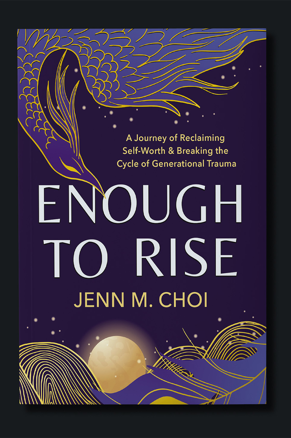
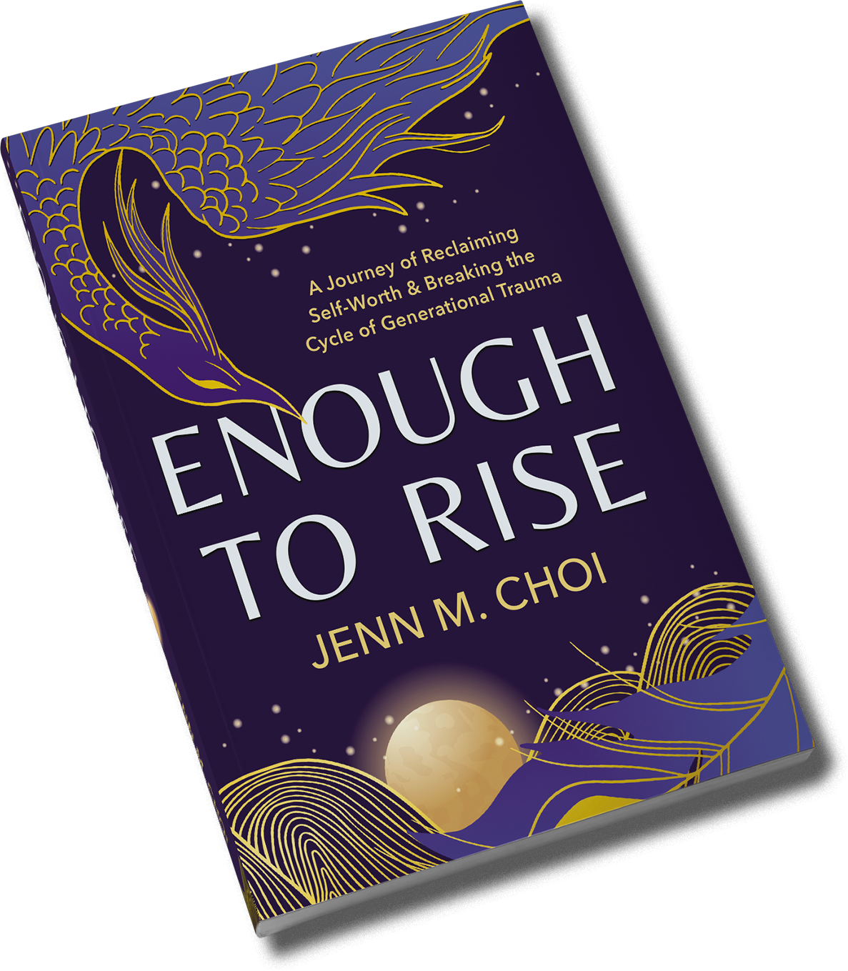
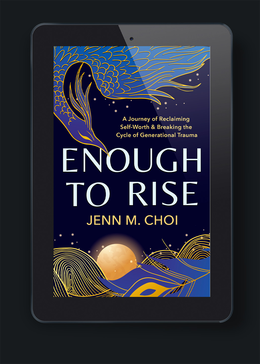
Jenn provided us with a few solid starting points for comparable books before we began our own. Otherwise, she had two simple requests: it needed to include a Phoenix, and it couldn't be warm-toned colors.
We kept that in mind during our own research phase. One thing we saw was that personal memoir didn't mean free for all in terms of design. There were still recognizable patterns in the types and styles, and based on that, we decided together that some kind of artistic exploration of Jenn’s cultural roots via the phoenix was the right way to go. We chose a dark aubergine-to-blue color palette with gold accents to add brightness to a story of struggle and growth.
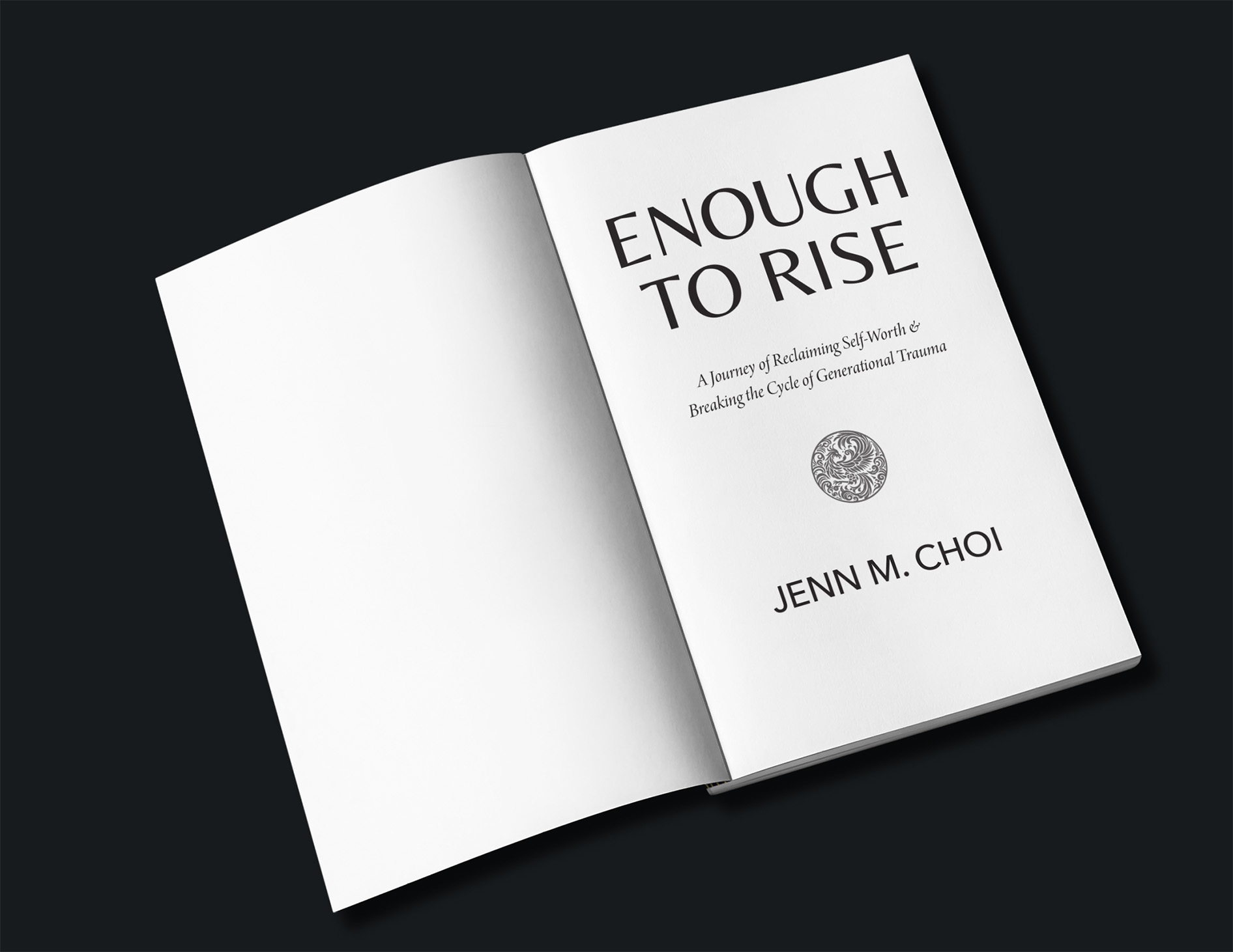
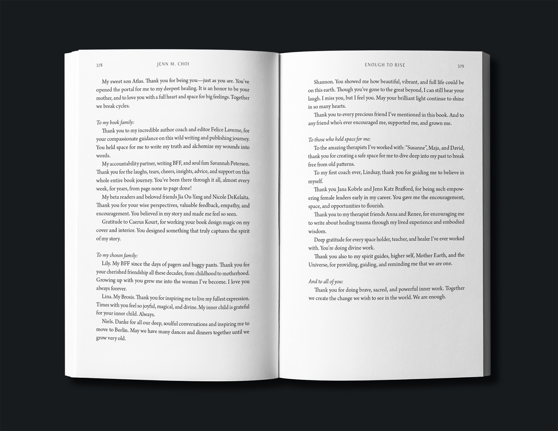
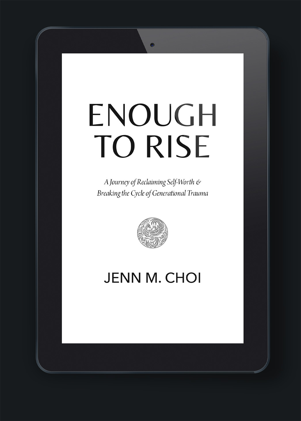
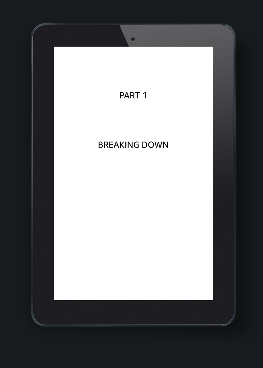
We decided to keep the interior design clean and simple, using the fonts and title structure as the main visual design pulled in from the cover. Instead of a large phoenix we decided to use a small phoenix emblem on the title and part pages to call a to the cover without overtaking entire pages with art.
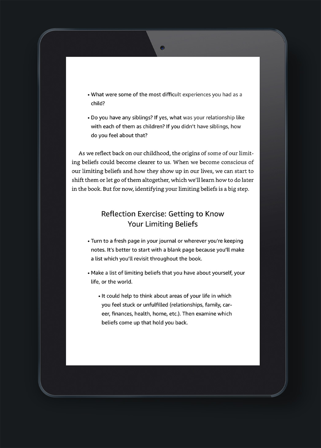
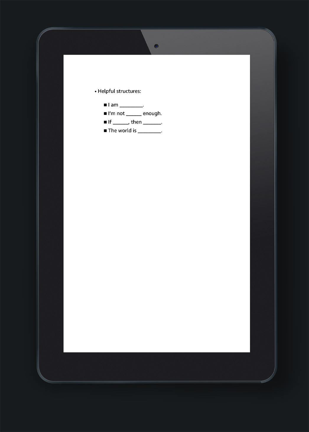
Since this isn't strictly a memoir, we had to also consider structural details about the inner work sections at the end of each chapter. The reflection sections and workbook-style checklist sections needed to be distinct and easy to find, which we achieved with scene breaks and sub headers.
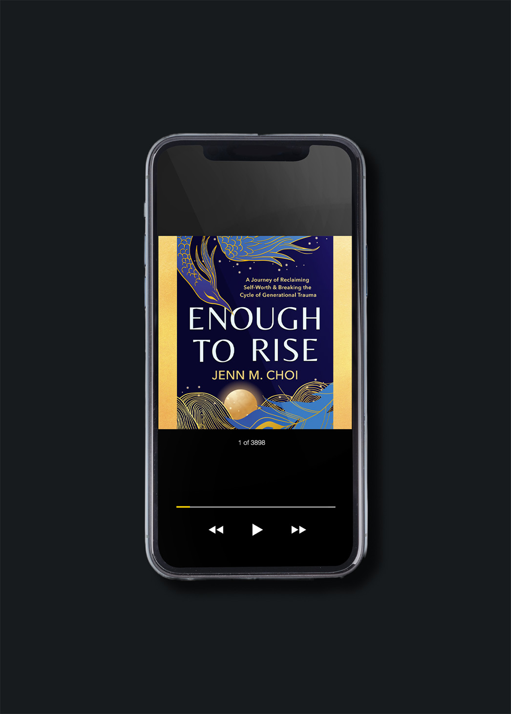


Jenn decided to keep accessibility open and added ebook and audio to the purchase options as well as print. The design didn't work via resizing to the square audio dimensions, so two gold bars were added to either side the cover to make it the required square and not lose design details from the original vertical layout. Now Jenn can reach her readers however they need her to.
It's not too often in book design that you hear that your book design has made someone’s ancestors happy, but that was some of the wonderful feedback Jenn gave us near the end of the project. We know Jenn and her clients are going to get a tremendous amount of value from her personal stories and the tools she gives them to start their own healing journeys.
Honestly, I cannot stop staring at my stunning cover and interior, which capture the soul of my book Enough to Rise. Caerus was understanding and flexible, even when I had to change my book title and shift timelines for submitting my final manuscript. They met my unexpected changes with kindness and always welcomed my questions. Their empathy was so very appreciated. – Jenn M. Choi

