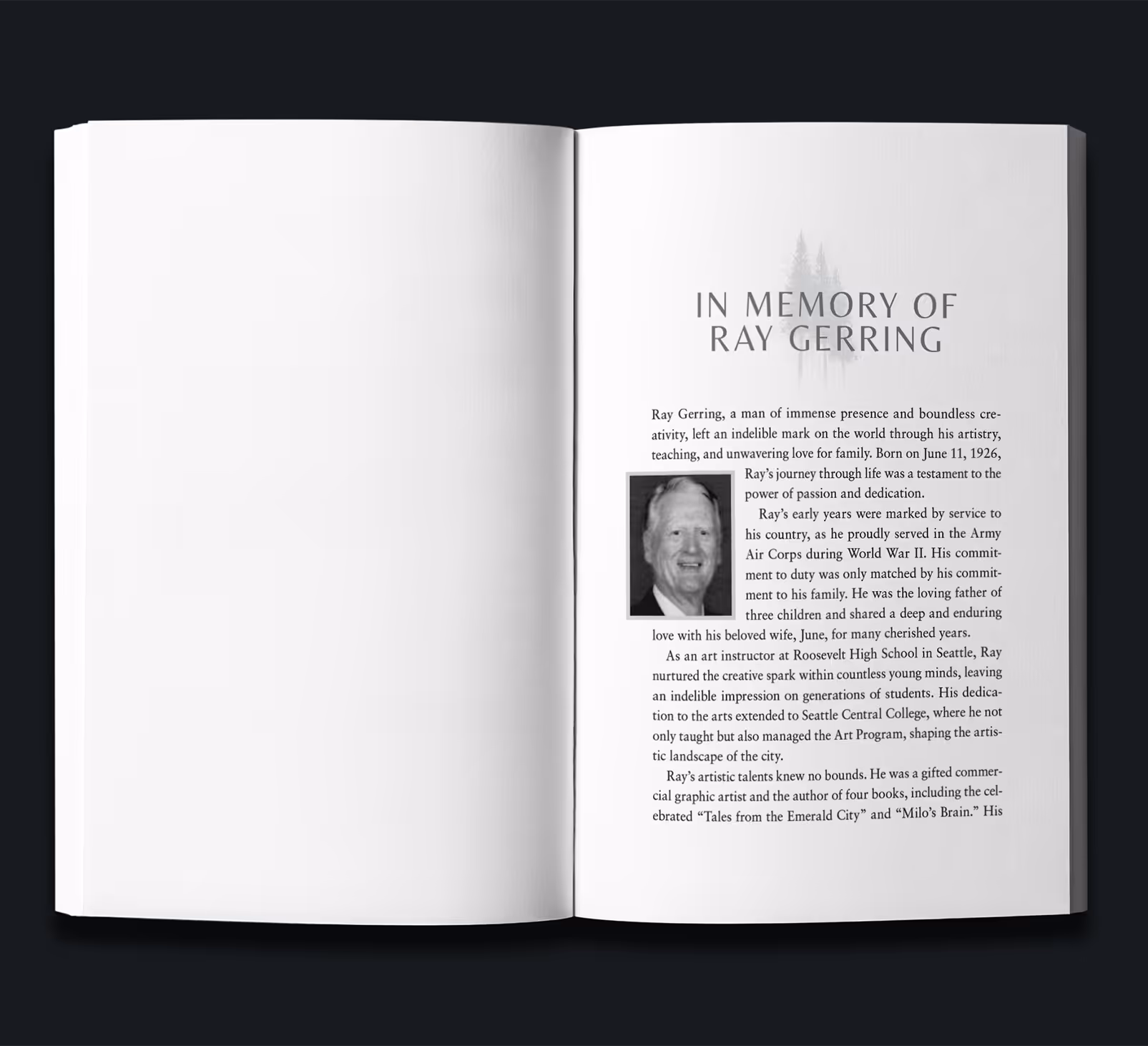
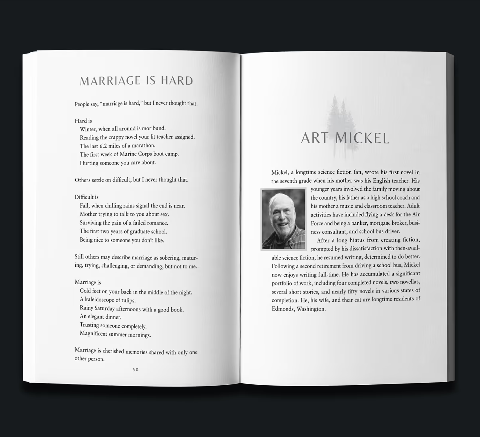
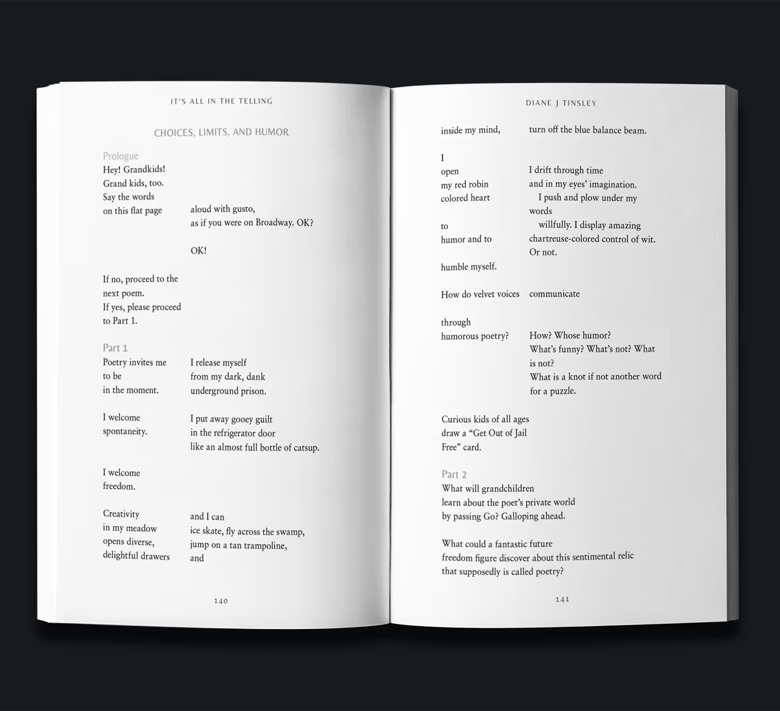
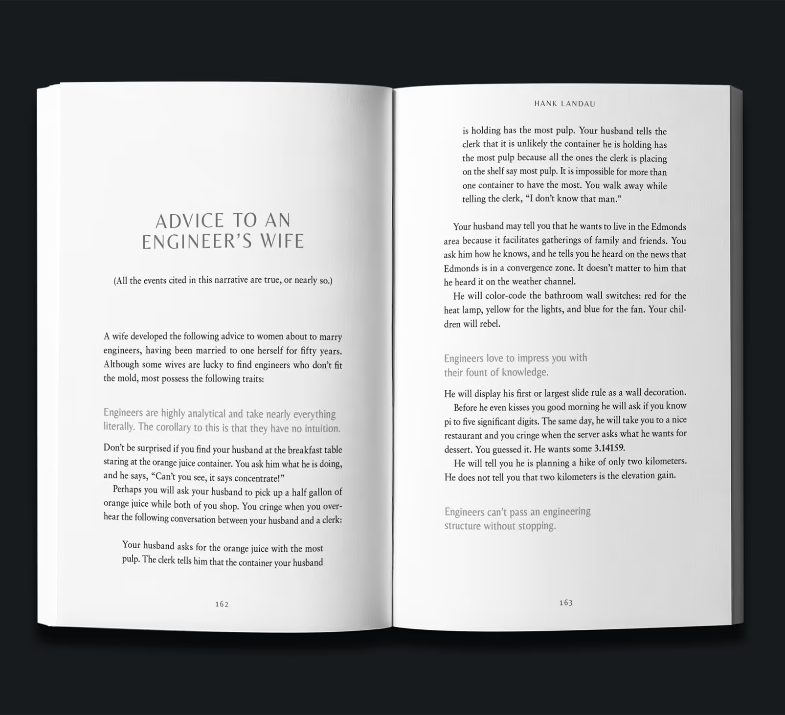
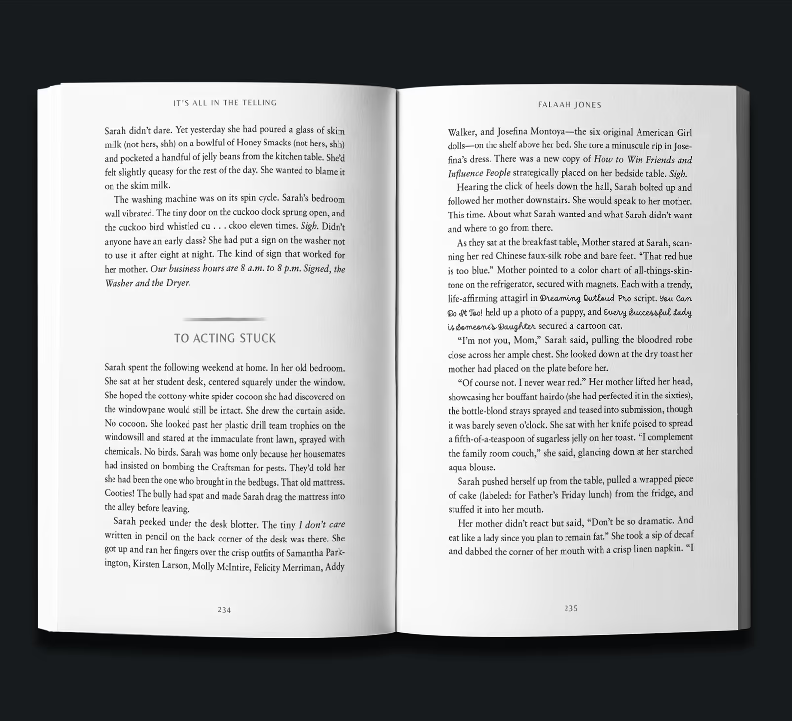
It’s All in the Telling is an anthology published by the Inkwell Cooperative. It features several authors writing in several genres who all had to approve of their portion of the layout, not to mention agree on the design direction.
The book was structured so that each author had their own feature page that talked about them and their work, and then collections of short stories, poems, and prose followed. Some of the poetry especially needed strict attention to structural detail and work.
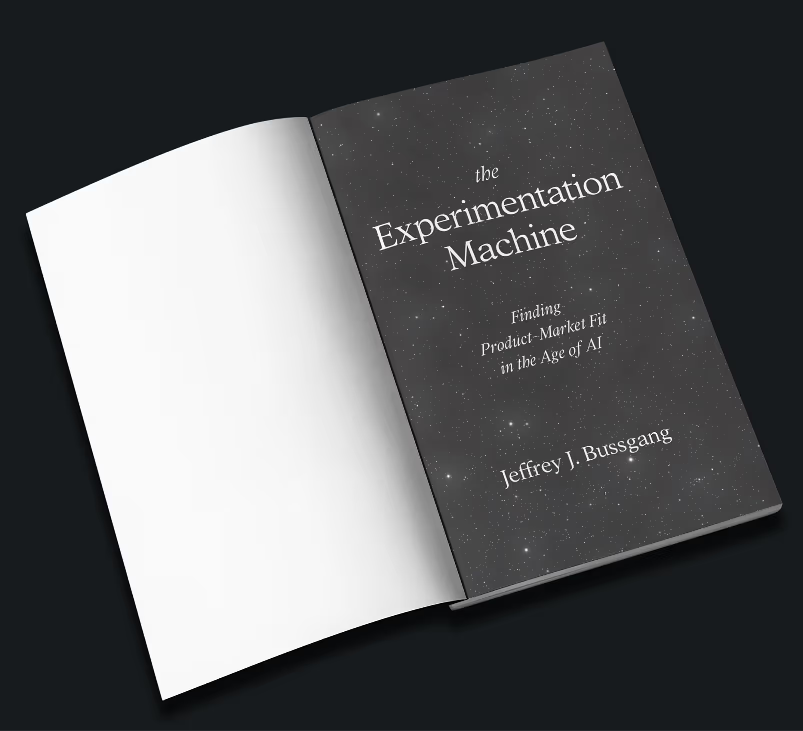
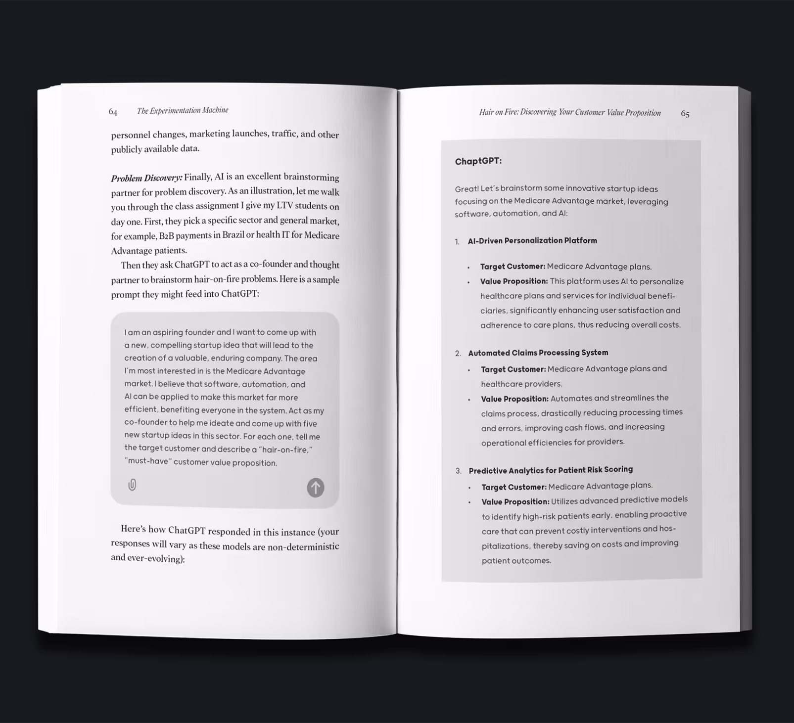
The Experimentation Machine is a business development book approaching how AI can be utilized to maximize benefits while simultaneously preserving ethical standards.
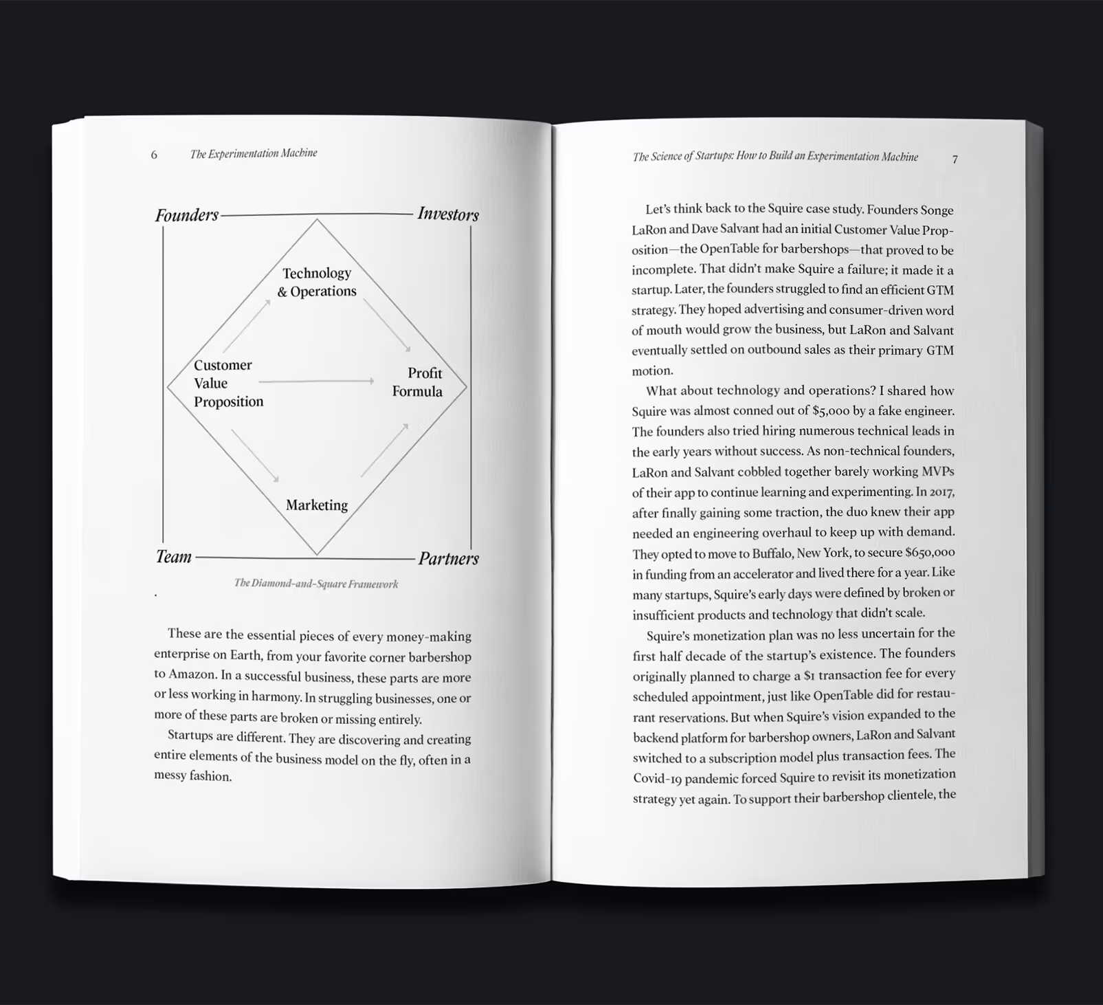
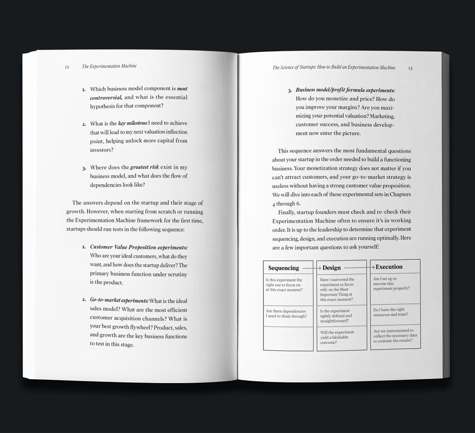
This book required full design development, including the visuals, as seen on page 6, 13, and 64–65. Since this book is about honesty and ethics, We decided to go with an ultra clean and straight-forward approach, preferring simple lines and variations of the body font over excessive icons or grey shading.
The Experimentation Machine is a business development book approaching how AI can be utilized to maximize benefits while simultaneously preserving ethical standards.
This book required full design development, including the visuals, as seen on page 6, 13, and 64–65. Since this book is about honesty and ethics, We decided to go with an ultra clean and straight-forward approach, preferring simple lines and variations of the body font over excessive icons or grey shading.
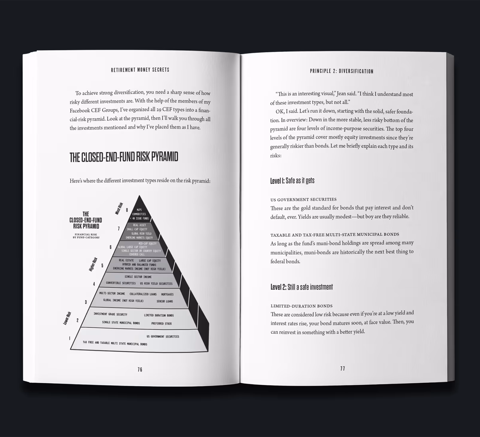
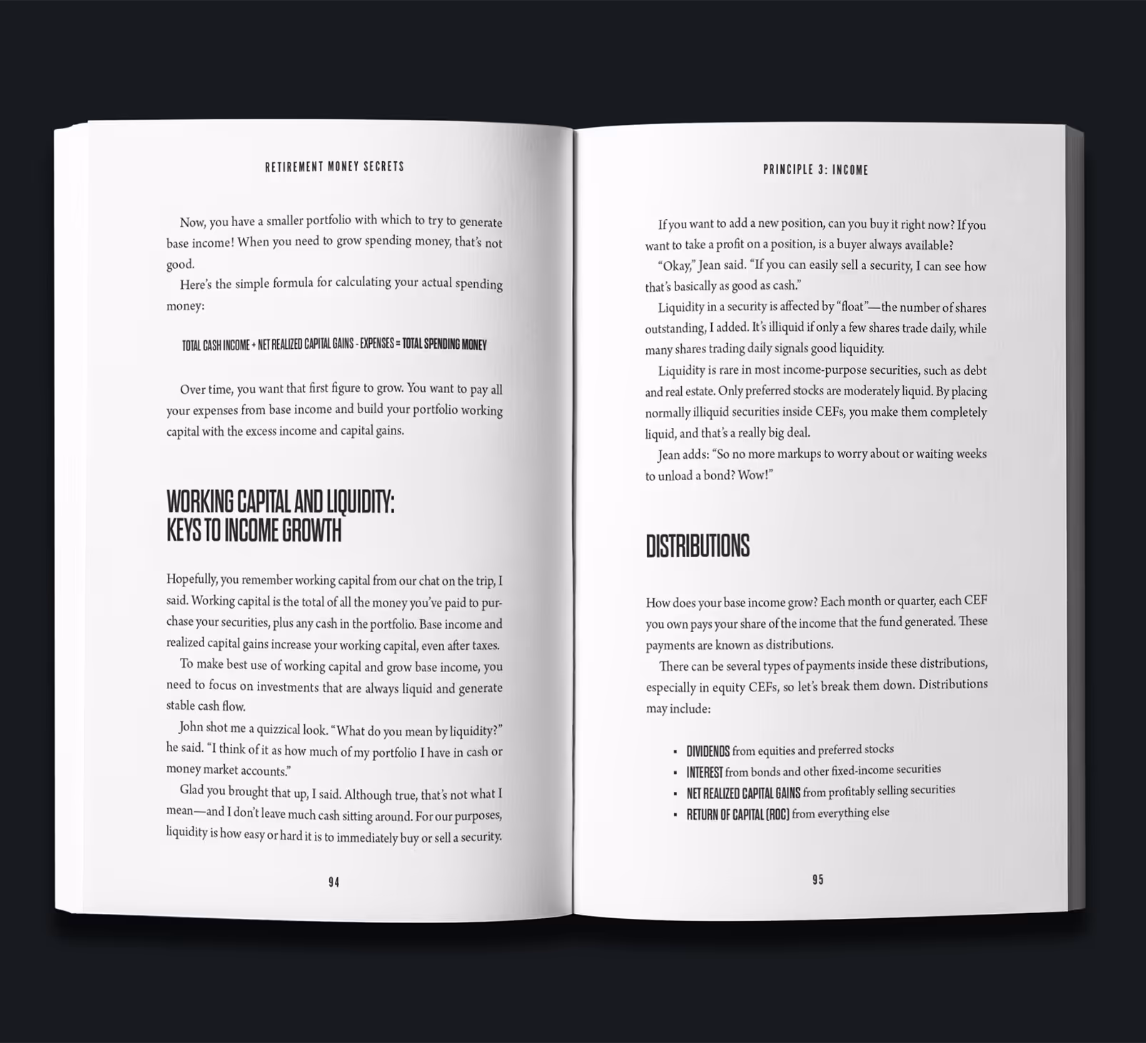
Retirement Money Secrets is a financial investing book focusing on helping the reader make big money. Because of this focus on big, we decided to make the dollar sign front-and-center of the design, with the title in thick, tall sans-serif font set over it.
There we no modesty here in the book's claims or goal, which was expressed through the title typography, but the book is also well-structured and thorough, so it required a more serious tone with the body font, multi-level structure, and custom-made figures.


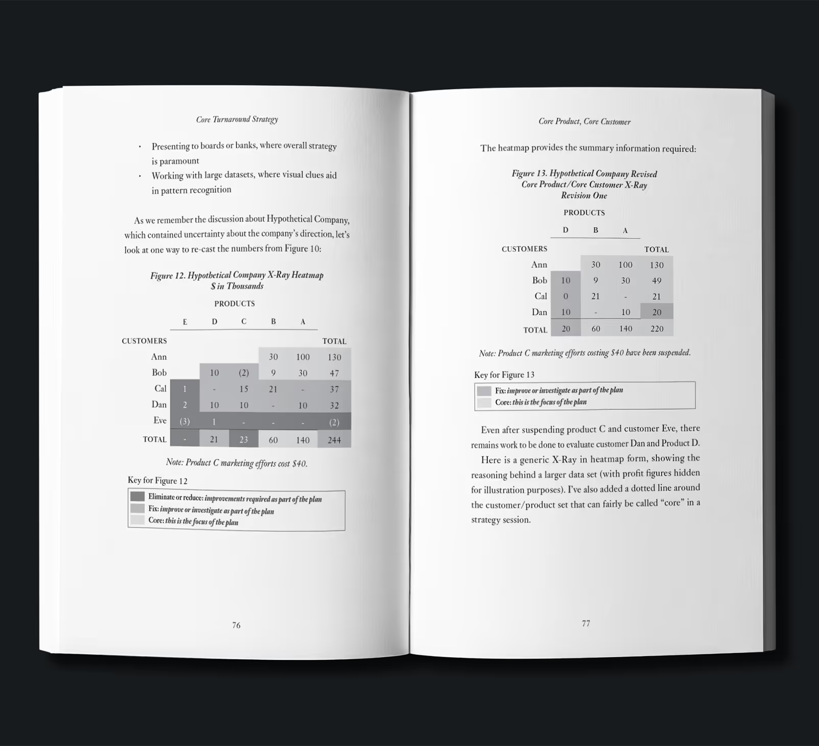
Core Turnaround Strategy is a business restructuring guide for failing businesses that need to turnaround, or face going under. Knowing that, the audience was of course going to be business owners, ones that would read legacy publications like the Economist to keep up to date with business and the economy.
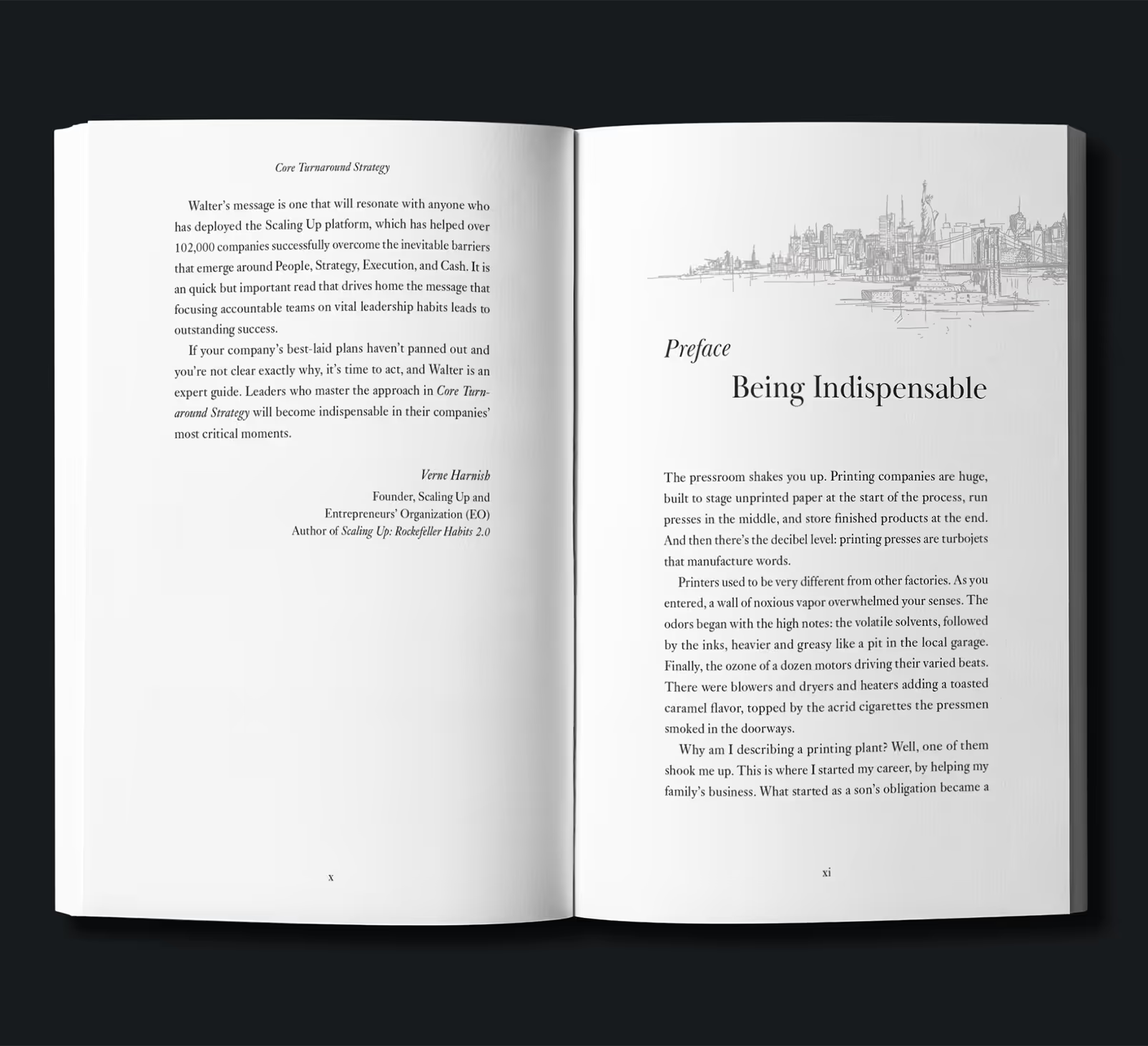
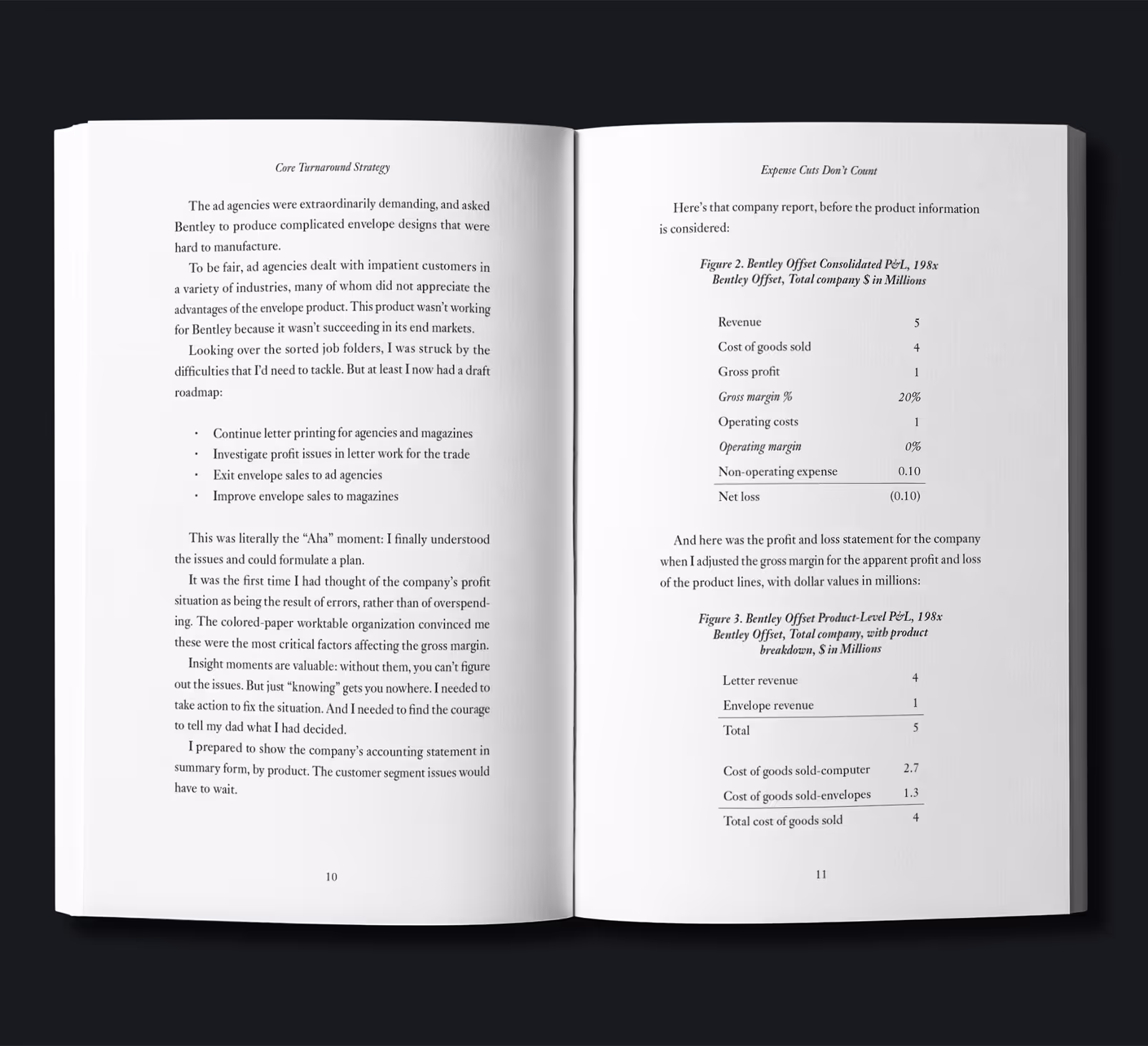
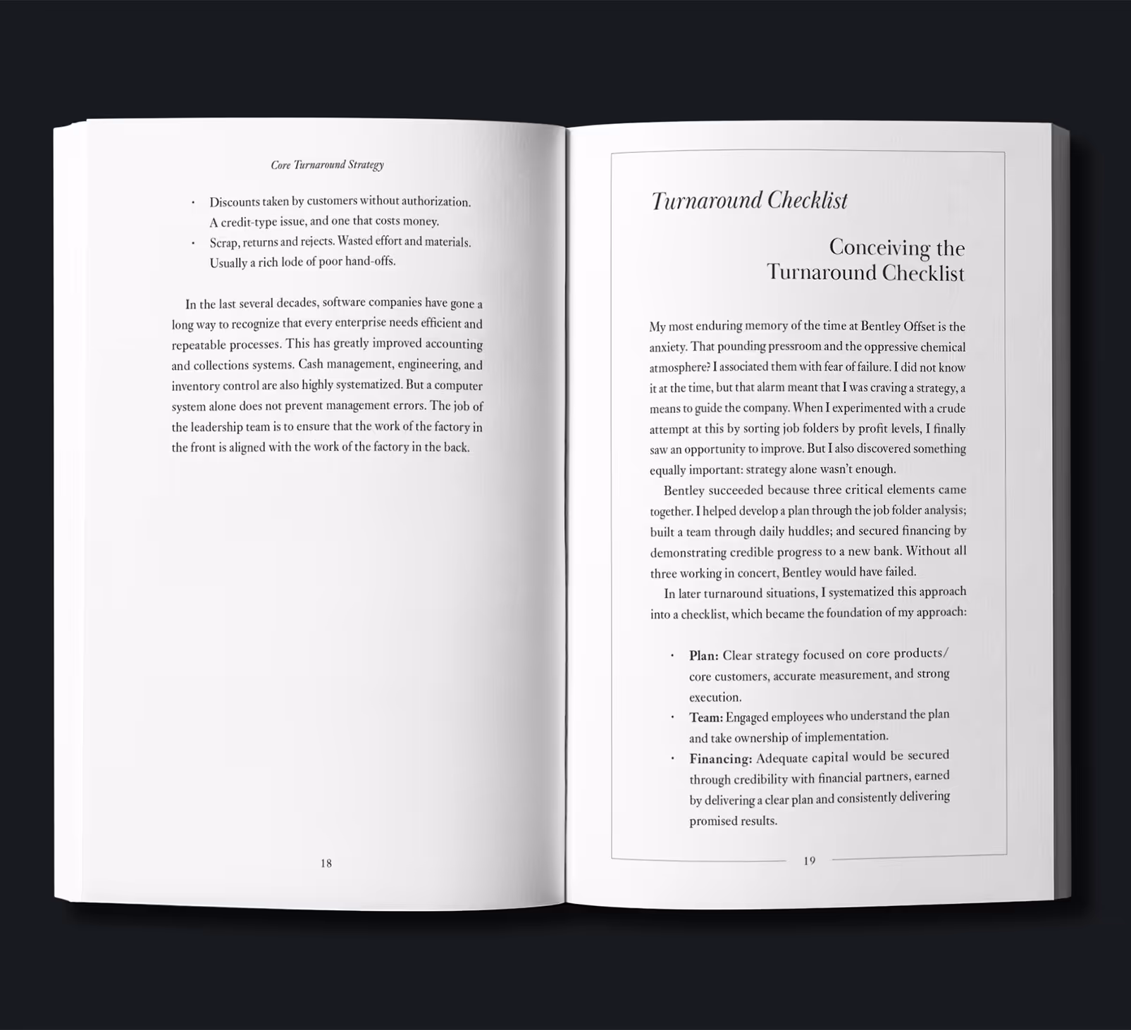
We then focused on a design that held that classic feel, using variations of the font Baskerville to give a booming-business, mid-century feel. Besides the NYC skyline on the Preface where Walter talks about his early work in the city, the design itself depends almost strictly on the font used in the body font and custom-made figures to set the tone.
Core Turnaround Strategy is a business restructuring guide for failing businesses that need to turnaround, or face going under. Knowing that, the audience was of course going to be business owners, ones that would read legacy publications like the Economist to keep up to date with business and the economy.
We then focused on a design that held that classic feel, using variations of the font Baskerville to give a booming-business, mid-century feel. Besides the NYC skyline on the Preface where Walter talks about his early work in the city, the design itself depends almost strictly on the font used in the body font and custom-made figures to set the tone.